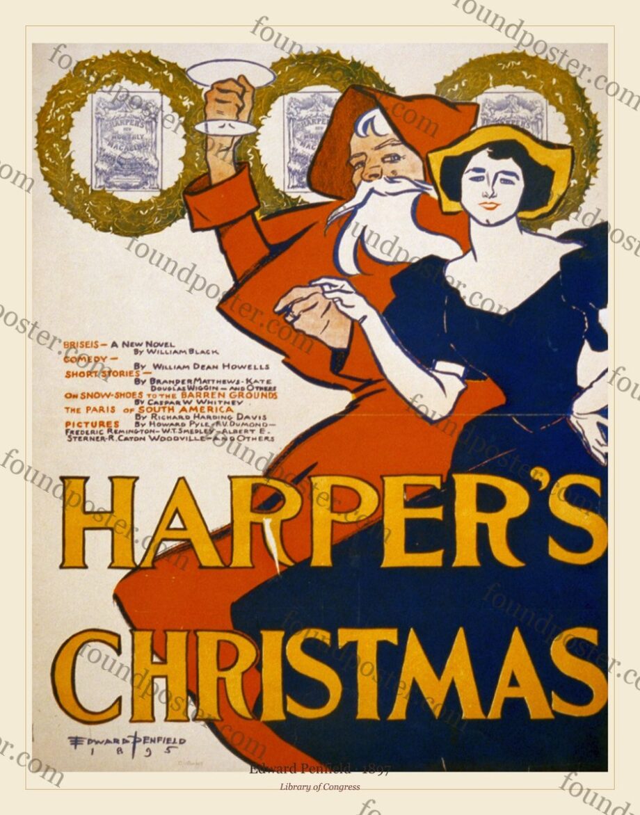
TL;DR — Edward Penfield’s cover poster for the Christmas 1897 Harper’s Magazine is a cornerstone of the American poster movement. As art director of Harper & Brothers through the 1890s, Penfield designed a placard for nearly every monthly issue, and in doing so gave the United States its own poster style — flatter, calmer and drier than the French, closer to Dutch design than to Montmartre. This is the story of the artist, the magazine, and the decade when America learned to make posters.
By Found Poster · Published July 2026
The poster and the moment
By 1897 the United States was in the grip of what contemporaries called the ‘poster craze’ — a brief, intense fashion, running roughly 1893 to 1897, in which magazines and books were advertised with artist-designed placards, and a collecting mania grew up around them almost overnight. Harper’s Magazine was at the centre of it, and Edward Penfield was the reason.
The Christmas 1897 cover is Penfield at the height of that moment: a single well-dressed figure, a few flat colours, a firm outline and almost no background. The seasonal subject is almost beside the point. What carries the image is its poise — the confidence to leave most of the sheet empty.
Edward Penfield at Harper’s
Edward Penfield (1866–1925) was born in Brooklyn and trained at the Art Students League in New York. In 1891, still in his twenties, he became art director at Harper & Brothers, then one of the most powerful publishing houses in America, and he held the post until 1901.
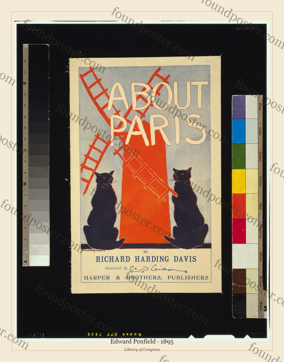
From about 1893 he designed a poster for nearly every monthly issue of Harper’s — a sustained series unmatched by any other American artist of the period. Working to a monthly deadline forced a discipline of economy: a poster had to be designed, drawn and printed fast, and read instantly on a newsstand. Penfield turned that constraint into a style.
The American answer to Paris
Penfield knew the French poster — the swirling crowds of Jules Chéret, the flat silhouettes of Toulouse-Lautrec. But where the French filled the sheet with movement, Penfield emptied it. He took the flat colour and hard outline of the French school and made it still, calm and deliberately understated, closer to Dutch and English design than to the cabaret.
That restraint is exactly why the work still looks modern. Set beside Lautrec’s Moulin Rouge, a Penfield is the opposite temperament reaching the same conclusion — that a poster is flat colour, bold shape and empty space, not a painting shrunk onto paper.
A coherent body of work
Because Penfield produced a poster almost every month for the better part of a decade, his output forms one of the most coherent bodies of work in the whole history of the medium. The covers share a temperament, a palette and a hand, so several hung together read as a series rather than a jumble — a genuine advantage when you are composing a wall.
That coherence is also why institutions collect him in depth. The Metropolitan Museum of Art holds a major group of 1890s American posters, catalogued by David W. Kiehl for its 1987 exhibition, and Penfield sits at the centre of that story alongside Will Bradley, Louis Rhead and Ethel Reed.
Where the tradition sits now
Penfield is the anchor of what is now called American Art Nouveau — the United States’ distinct contribution to the international poster boom. His quiet, confident images suit a boutique hotel lobby, a reading room, or a bar that prefers composure to spectacle. Where a French cabaret poster raises the temperature of a room, a Penfield sets a calm, expensive-looking tone — which is exactly the effect Harper’s was buying in 1897.
Penfield’s Harper’s covers and calendars are catalogued individually in our archive, restored for printing. Browse Edward Penfield →
Frequently asked questions
Who was Edward Penfield?
Edward Penfield (1866–1925), art director of Harper & Brothers from 1891 to 1901 and the leading figure of the American poster movement of the 1890s. He designed a poster for nearly every monthly issue of Harper’s Magazine.
What is the ‘poster craze’?
A short, intense fashion of roughly 1893–1897 in which American and European magazines advertised themselves with artist-designed posters, sparking a collecting mania. Penfield’s Harper’s series is its defining American body of work.
Why does his work look so modern?
Because of its economy. Penfield reduced an image to flat colour, a firm outline and large areas of empty space — the same principles that underlie twentieth-century graphic design.
Do the covers work as a set?
Yes. Because he produced a coherent monthly series in one hand and palette, several Penfield covers hung together read as a considered group rather than a mix.
Further reading
- Toulouse-Lautrec’s Moulin Rouge: La Goulue — the French counterpoint
- Who was Edward Penfield? — a fuller survey (scheduled in this series)
- American Art Nouveau and the poster (scheduled in this series)
- David W. Kiehl, American Art Posters of the 1890s in the Metropolitan Museum of Art (Metropolitan Museum, 1987)
- Alain Weill, The Poster: A Worldwide Survey and History (G.K. Hall, 1985)
Found Poster restores Belle Époque and Art Nouveau posters from museum archives into archival-quality files you print yourself. Browse the archive · How to print & frame.